WIP teeshirt design.

WIP blog post header

Lately Student Council of my university department organized a contest for 2015 tee design and of course, I really wanted to take part in it. I didn’t win the contest but I did create some quite fun designs I would love to share with you. Since there was no limit for amount of designs per designer I submitted 3 designs.

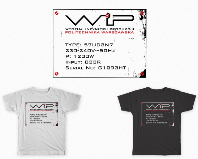
Since my university is a University of Technology I decided to strongly incorporate the technical aspect into the design. Short name of my department is WIP so obviously wanted to play with those letters using them as a base of the whole design and giving them refreshed new look. General idea I started with was creating all 3 letters with single stroke. After some various sketching and editing of the sketches I came up with red dot idea to make it look more technology-oriented and give it some focal point that would concentrate attention instead of letting it get scattered.

Maria Daszczuk_WIP_projekt koszulki_1

Maria Daszczuk_WIP_projekt koszulki_2

After creating more simplistic designs (as you can see above) I decided to incorporate one of those in more complicated design. I drew the inspiration from look of the nominal plate that is placed on various electric devices. I added some screws and distressed, rusted effect to make it more interesting and worn-out look that the nominal plates usually sport.

Maria Daszczuk_WIP_projekt koszulki_3

I hope you enjoy this project just as much as I do! : ) I am really proud of what I created even if none were chosen in the end.

Fonts used: Bank Gothic

Relations in the world of creative minds.

relations blog post header

After some unpleasant interactions with other designers online on the designer contest website I started to think about relations between different designers as well as creatives in general on how they work with and treat each other.

Situation was simple – after taking part in contest I noticed a design eerily similar to mine. After pointing it out to the creator I got very unpleasant and hurtful response. Not going into details – the other designer together with his friends started to look for stock vectors they could pin to my designs and they managed – with a simple shape of an open box. I did not use the stock vector shapes but I asked the administrator to remove the design from contest to stop any

false accusations. It did affect my way of looking on them – I got called a ‘clipartist’ and ‘thief’ numerous times in that incident but the worst was that the whole situation was going mostly behind my back – instead of confronting me and asking for my comment on the situation I was presented

on some fanpage on Facebook as the evil thief without a chance for any explanation.

The whole situation made me think about how vicious and hurtful other designers were, not only judging very harshly my designs, my skills but my personality as well (not even speaking to me once). The creatives I met personally were always warm and helpful and probably the sweetest group of people I ever came in contact with. So was I lucky or there is some distinction to be made?

I do not plan to go into psychology of the internet interactions, how ‘anonimity’ makes people obnoxious etc. What interests me more is how such contests turn the healthy designer community into crazy rat race. Because this is exactly what I experienced while using such websites.

The competition itself is very healthy. It lets creatives explore one topic in numerous ways, from various perspectives and angles. The contests sites like one I was using encourage low payment for services (usually significantly below the amount designer would ask for when working directly) and create unhealthy for creativity environment. People taking part in such contests are young designers without established status, ones who treat this as an additional source of income or the desperates who just want to get ANY money of their work.

The idea of contest itself is icky to me. Tens, sometimes hundreds of creative workers spending hours on something that only one will be paid for? And not even an amount that is worth it (usually)? That is somewhat unsettling to me. The contest sites glorify contest creators somewhat treating designers as a sure thing. They seem to not get that without the designers they business will die. During my short stay on the rather small website (2-3 weeks) 4 designers deleted their accounts and will probably be followed by me. Seems not much but what if you have 40 active designers? Or even less? Usually in one contest there is usually around 20 designers. 4 is almost a 25% of them. So this should be a number significant for an admin. It doesn’t seem to be though.

And as always, the unhealthy environment on the website creates a bad atmosphere of a rat race between designers, who often are quite desperate to win ignoring etiquette and their open mind. They become rude, wanting to win no matter what.

The designers and other creatives I know personally are the sweetest, most fun people I know. They are full of life, energy and ideas. We shouldn’t let anyone chase us into situations when we put money above creativity and its’ positive outcome. We create the aesthetics of the world that surround us and let’s not let the money and some pointless rivalry affect it in negative way.

Draw that again – 2003 vs 2015 edition.

Lately my work life is overshadowing every other aspect of my life – including this blog. I decided to finally do something worthwhile to put up here and try to make my blog running again : )

Possible that posts now will be simpler and rather include works in progress or some finished products with small commentary.

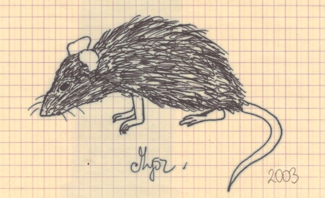
So, to go on the current subject. While cleaning up some old books on my shelves I found very very old fine liner sketches I made as a child. It made me quite happy that they were time stamped – on 2003, so when I was 11-12 years old. You can see how time passed affected the paper and the lines themselves. I shared them with my friends and one of them planted in my mind an idea to redraw them and make sort of comparison of those old childish sketches to my own take on them 12 years later.

burd mouse2015-02-28 001

After examining them a bit I created a basic sketches using thick mechanical pencil (1.3 mm) on grid paper having fun with shapes trying to keep basic shapes and posing (alternating it a bit to improve it on final version).

2015-02-28 002 2015-02-28 001

I actually enjoyed that project and if I find more old works like that I might consider playing with them like that too. After creating basic outlines I decided to add to my revamp some more interesting twist by adding a color to the designs. You can also see I shortened bird’s legs to make it look more ‘realistic’ in shapes at least 🙂

birdie popart-01mouseywatercolor-01

It is quite simple yet pleasureful project, I really enjoyed reacting those illustrations. I hope you like them too! 🙂 They really brought me really nice break from everything else and I enjoyed that a lot. Had to share those : ) If you ever did something like this please share those with me, I would love to see the improvement over time of other people as well : )

Memories from Sweden poster set.

memories from sweden

Not long ago I was approached by my coworker with a commission for designing series of posters for her. I was delighted when I heard that, especially knowing her great taste in design! The brief was simple – 3 minimalistic posters that will be depicting things connected to her Erasmus trip to Sweden. She also had a quite good idea how she wants posters to look which made process even more enjoyable. Short brief I received:

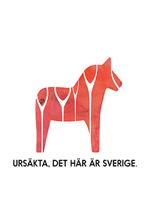
Posters 1 & 3 – Dala horse with watercolor-style texture and delicate decorations + quote in Swedish

Poster 2 – Collection of quotes and buzzwords surrounding her trip and bringing back her memories

Inspiration material:

I loved the concept of posters immediately and quite quickly got to work. First thing to do was coming up with decorative elements to place on the horses. Those are sketches I provided my client with:

dala horses sketch

You can see ones she had chosen marked with an arrow : )

Based on those, I started to work on digital version. I used couple watercolor textures merged together and edited in Photoshop. After that I vectorize watercolor texture I created with Image Trace operation in Illustrator. That step was necessary since the poster was much bigger than textures size. Then I resized it to cover all the surface of the Dala horse.

The next step I did was creating vector representation of the designs I created for horses. I placed them then over the vector shape of a horse (which I created earlier and printed to sketch designs over).

After adding a quote the Dala horse posters were pretty much done. Then I moved on to middle poster with quotes. To fill them nicely on the surface I decided to create sort of labyrinth of words with different weights and sizes of same typeface. Then I empathized words that were most important with same red watercolor effect just as horses to tie all posters together with same theme.

posters_Malin_Strona_1 sm  posters_Malin_Strona_2 sm  posters_Malin_Strona_3 sm

My client was very satisfied with final outcome and I must say I think it ended up really good.

Final posters:

posters Malin

Font used: Nanami Pro

Hope you liked that project, I am really proud of how it went and I think my client feels the same. I hope I will get in future much more awesome projects to work on like this one! 🙂

first font creation project.

blogpost font

Hello, sorry for being a bit late. I know I also missed last post but I decided to pressure myself less into making 2 posts a week and always on time – I am finishing my studies right now and I simply do not have the time to work on that much projects and posts each week. So, without further ado – lets get to the post.

Lately I got idea for creating my own font – I wanted to do something like that since a while but I just never really had a time or idea that would captivate me so such plans were put away over and over. Finally though I got the idea I decided I want to explore and I am slowly working on glyph shapes etc. I want to make it in variety of weights and widths but we will share how that will turn out. Possibly it will end up as just one, regular weight font – we will see how it will go.

WP_20150129_22_53_23_Pro

Here you can see the preview of my first sketches for glyph shapes – idea is to create all letters with one continuous stroke.

one line alphabet_abcd

After I got general idea of how i want all letters to go, I started creating digital previews of them in Illustrator – I might not be able to create font there but it’s a vector creating software I am most familiar with so this was my go-to. After playing a bit with grid and different strokes I created digitalized preview of my font. It is still very rough and needs lots of work but since this will be longer, ongoing project I decided to share it step by step, not my usual whole project in a post thing :). For now I am planning to show just a previews, since I want a final result to be more exciting. At least this is what I am hoping for.

I hope you like my font idea and you will follow how it is progressing over time! I am surely having lots of time with it, especially with not pushing myself to finish it in a week or two and just make it a project I will develop in free time as relaxation tool. Please share with me your thoughts about the idea itself as well as execution : )

beyond the sun – fake album cover design.

beyon the sun banner

I am very sorry for being so late with this post but wordpress for unknown to me reasons didn’t allow me to upload any media >< I promise I will try to clean up my act in posting on schedule department : )

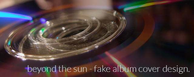
Lately I listened a lot to Shinedown and I became strongly inspired by one of their songs called “Beyond the sun”. I started to think how would I see cover for this song’s single and decided to make it next of my personal projects. After some time with blend tool and different object modes I created the cover you can see downstairs. I wanted to make it very dark – as you can see it is mostly black. It somehow made sense that beyond the sun everything would be dark and barely lit. I wanted text to be delicate and not dominant at all, but become part of illustration I created for cover. At first I was working with pinks but over time I decided to give it more of orange-y tone.

beyond the sun_shinedown_CD cover-01

When I started to create light effects I got a bit overboard with them but after some time I decided that less is more and simplified illustration. That definitely made it look much more interesting. After adding some more details I decided to just stop to not overdo it again. The final step was adding single title and band name to finish fake album cover look.

beyond the sun

So, this was definitely a lots of fun to create, I hope I will get such nice inspiration from my favourite music more often 🙂 Did you ever let your inspiration lead you this way? I never was doing things like that (till now) and I must admit I really did enjoy that project 🙂

origami totem poster.

origami totem

I did lack inspiration lately, not being able to really pull off something good in my spare time. Finally as I sat to some specific projects my creativity just unlocked again so I had to use it 🙂

My latest creation is the one presented here – it started fully as digital project (unlike my regular ones that I start on paper. The idea was to create Native American Indian totem inspired illustration. My idea was completely different at start though – I wanted to keep the bird drawn with thick black strokes and colourful stained glass like fill. After some consideration tough, after I had the lines done (thanks to amazing grid tool 🙂 ).

totem-02

This is when I started to consider another finishing for my totem carvings inspired bird giving it low-poly/origami kind of feel. When I decided on that concept I knew from the start I want to keep it in pastel palette, even if this is not my usual choice. I worked out 3 palette possibilities (after some inspiration from colourlovers collection) – orange, blue or pink. Since I usually do not work with pink I decided to risk it and challenge myself with usage of that color. I created pastel pink palette (with touch of peach to make it less common) and added blue background. Then I decided to give it a bit of twist and apply long shadow (for which craze finally caught up with me). As an additional twist on it I created gradient from dark muted pink on 100% opacity to black on 0% opacity. After bit of consideration I added also text. As a finishing step I added on multiplied layer of bird but instead of fill it had 1 pt stroke in dark muted pink with 20% opacity and the illustration was finally done.

totem-01

Because of color choices and different turns I took on the way the former inspirations are not as visible as I thought they will be but I still love the final result. I think it was really nice small project that I really wanted to share. It was amazingly relaxing to work on it and I hope finishing this small illustration will help me get inspired for another projects : )

Font used: Garda Filler

Book review – Color Inspirations

5761927181_3d4449f00c_z

Sorry for another late post, especially right after resolution to keep it going more properly. I had my best friend staying over for a week though so it did change my schedule a lot 🙂

Color inspirations by Darius A. Monsef the IV is a book created by colourlovers.com in collaboration with HOW Books. It is very interesting collection of various palettes created by users of this site presenting them in very easy to browse form.

The book is opening with introduction into color theory presenting most important rules to keep in mind and explains how to use tools that colourlovers.com provides on their site for creating palettes. Color theory here is very condensed and limited to most important rules but it does what it wants well – creates good basis for future exploration of this topic for people who would like to learn more about it. It gives good foundations for anyone who just wants to get the basics though. Short description of tools you can use to create palettes on site is really very nice for someone not familiar with that system but willing to learn it and start their own adventure with palette creating.

After the introduction into color theory book provides us with long chapter divided by colors. Each color category is separated into 2-paged palette sections – monochromatic, analogous, triadic, split-complementary, complementary and other. Each palette is followed by palette’s name, name of the user of colourlovers.com site who created it and CMYK, RGB and HEX information about all colors included into palette. To makes things even easier to use, there is CD included that carries all palettes that are shown in the book in digital versions – in ASE, Expression, GIMP and HTML formats. All that is followed by Read me file that includes all information about files you need for proper usage of them.

After palette chapter comes chapter called Color In Nature which features palettes created on basis of nature’s photos – from landscapes to animals. Palettes included in this section are followed by same information as palettes in Color Palettes chapter and also are included on the CD. Last section of the book is Index of URLs of palette creators. All palettes can be tracked here and found on the colourlovers.com website.

In my opinion book is beautifully designed, easy to read and very inspirational. The color combinations presented there aren’t always the most obvious ones which makes them more unique and outstanding to use. I also admire the fact that CD is included, providing users with any info that is required and making use of external palettes extremely easy.

The other thing I like is the way CD is mounted into the cover. It is set inside the cardboard and covered with plastic cover that prevents CD from getting damaged or falling out. Personally I keep all my CDs in separate binder but this is a very nice touch.

The only thing that bothers me with that book is its’ binding. I think that spiral bound books are easy to use but because of being bound by shorter side of pages the book seems bit wobbly and I am often scared to use it afraid it would simply break. It does please me esthetically though so I cannot complain about it too much. Be aware though this is a book to be rather used on desktop in calm environment, not really on-the-go solution.

In general I think it is a great addition to my design book collection and I really like to look through it. It sometimes gives me inspirational kick that I need from time to time and it is great source of color combinations in case of any struggle on that area.

The truth is that you can get those palettes directly from site but this book is a great catalogue of those and makes browsing palettes easier. Since book was released in 2011, the collection of palettes on site definitely grew greatly but colors do not age, do they? 🙂

The book may seem useless but I still consider it a great tool and source of inspiration. It is not a book I would call must-have, but it is worth having.

To have a closer look on the book please visit colourlovers.com post about it HERE.

The book can be bought on Amazon or on HOW books website.

I hope you did enjoy that post 🙂 I plan to review some other books from my collection so please stay tuned!

Freebies – free january 2015 wallpaper.

This month’s wallpaper inspired by ice cubes (kind of, but actually this is what it makes me think about right now 🙂 )

Download the whole pack here!

The wallpaper is available in 2 versions – with and without monthly calendar. Clicking on the picture will allow you to download whole pack of wallpapers in both versions and 4 sizes. This time I added also version for mobile devices 🙂

You can also download them separately here:

Calendar version: 1920×1080 | 1600×900 | 1280×720 | 1024×768

Clean version1920×1080 | 1600×900 | 1280×720 | 1024×768 | Phone

Older wallpapers I did – just click on picture to download 🙂

Llama Wallpapervespa-wallpaper1280x720december_2014_wallpaper_calendar_1280x720