![]()
Since lately I finally started to work as graphic designer, both in agency and privately as freelancer, I decided I need to prepare my own branding to represent myself properly as a professional designer. This is when I started to design my very own logo.
Main theme I wanted to convey was my initials: M A D , but I didn’t want letters to be too obvious like they usually are, since it’s unlikely I would be using my logo without a name. This is why I wanted to make design rather abstract, but still keeping basic letterforms. You can see here process of my sketching phase from first idea to the final form of the logo:
![]()
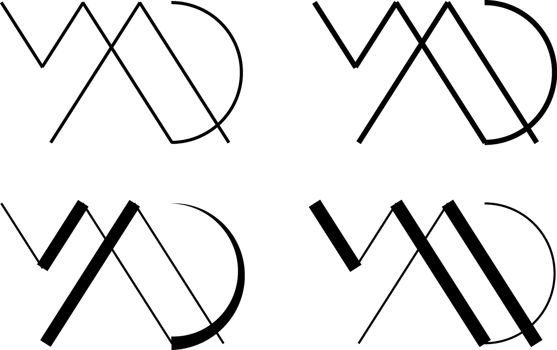
I am absolute flat design lover with minimalistic tendencies. That’s why I reached to the very core of letterforms – basic geometric shapes those letters come from: square for M, triangle for A and circle for D. For letter A and D the shape was kept, for M I decided to match angled lines with those that created letter A. Here can you see some digitalised variations I worked on, mostly playing around wih thickness of stroke.
And at last, final version (that you can also see in my blog’s header:) ), after sine tweaking and perfecting its’ form:
![]()
I am really satisfied with final design, I think it reflect my aesthetics as well as shows my sense of design. I hope you like it too!
Right now I am preparing business card project for printing for upcoming typography conference and I will surely share my thoughts and design process of that project too 🙂

One thought on “new logo design.”