WIP teeshirt design.

WIP blog post header

Lately Student Council of my university department organized a contest for 2015 tee design and of course, I really wanted to take part in it. I didn’t win the contest but I did create some quite fun designs I would love to share with you. Since there was no limit for amount of designs per designer I submitted 3 designs.

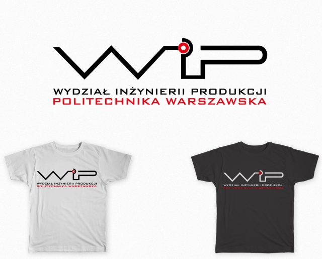
Since my university is a University of Technology I decided to strongly incorporate the technical aspect into the design. Short name of my department is WIP so obviously wanted to play with those letters using them as a base of the whole design and giving them refreshed new look. General idea I started with was creating all 3 letters with single stroke. After some various sketching and editing of the sketches I came up with red dot idea to make it look more technology-oriented and give it some focal point that would concentrate attention instead of letting it get scattered.

Maria Daszczuk_WIP_projekt koszulki_1

Maria Daszczuk_WIP_projekt koszulki_2

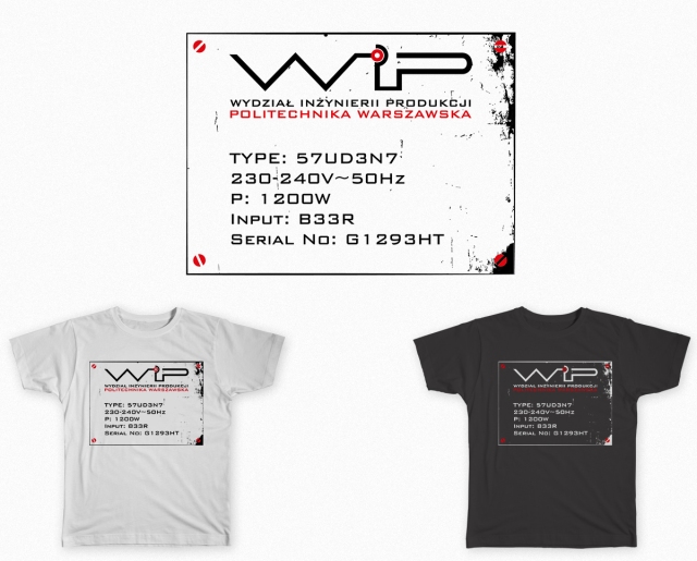
After creating more simplistic designs (as you can see above) I decided to incorporate one of those in more complicated design. I drew the inspiration from look of the nominal plate that is placed on various electric devices. I added some screws and distressed, rusted effect to make it more interesting and worn-out look that the nominal plates usually sport.

Maria Daszczuk_WIP_projekt koszulki_3

I hope you enjoy this project just as much as I do! : ) I am really proud of what I created even if none were chosen in the end.

Fonts used: Bank Gothic

Relations in the world of creative minds.

relations blog post header

After some unpleasant interactions with other designers online on the designer contest website I started to think about relations between different designers as well as creatives in general on how they work with and treat each other.

Situation was simple – after taking part in contest I noticed a design eerily similar to mine. After pointing it out to the creator I got very unpleasant and hurtful response. Not going into details – the other designer together with his friends started to look for stock vectors they could pin to my designs and they managed – with a simple shape of an open box. I did not use the stock vector shapes but I asked the administrator to remove the design from contest to stop any

false accusations. It did affect my way of looking on them – I got called a ‘clipartist’ and ‘thief’ numerous times in that incident but the worst was that the whole situation was going mostly behind my back – instead of confronting me and asking for my comment on the situation I was presented

on some fanpage on Facebook as the evil thief without a chance for any explanation.

The whole situation made me think about how vicious and hurtful other designers were, not only judging very harshly my designs, my skills but my personality as well (not even speaking to me once). The creatives I met personally were always warm and helpful and probably the sweetest group of people I ever came in contact with. So was I lucky or there is some distinction to be made?

I do not plan to go into psychology of the internet interactions, how ‘anonimity’ makes people obnoxious etc. What interests me more is how such contests turn the healthy designer community into crazy rat race. Because this is exactly what I experienced while using such websites.

The competition itself is very healthy. It lets creatives explore one topic in numerous ways, from various perspectives and angles. The contests sites like one I was using encourage low payment for services (usually significantly below the amount designer would ask for when working directly) and create unhealthy for creativity environment. People taking part in such contests are young designers without established status, ones who treat this as an additional source of income or the desperates who just want to get ANY money of their work.

The idea of contest itself is icky to me. Tens, sometimes hundreds of creative workers spending hours on something that only one will be paid for? And not even an amount that is worth it (usually)? That is somewhat unsettling to me. The contest sites glorify contest creators somewhat treating designers as a sure thing. They seem to not get that without the designers they business will die. During my short stay on the rather small website (2-3 weeks) 4 designers deleted their accounts and will probably be followed by me. Seems not much but what if you have 40 active designers? Or even less? Usually in one contest there is usually around 20 designers. 4 is almost a 25% of them. So this should be a number significant for an admin. It doesn’t seem to be though.

And as always, the unhealthy environment on the website creates a bad atmosphere of a rat race between designers, who often are quite desperate to win ignoring etiquette and their open mind. They become rude, wanting to win no matter what.

The designers and other creatives I know personally are the sweetest, most fun people I know. They are full of life, energy and ideas. We shouldn’t let anyone chase us into situations when we put money above creativity and its’ positive outcome. We create the aesthetics of the world that surround us and let’s not let the money and some pointless rivalry affect it in negative way.

can you have too much fonts?

blog post header

After every update of my font collection I start to wonder – does my collection of fonts grew too much already? I felt the difference especially after getting a bundle of fonts and total number of fonts installed on my laptop exceeded 3k. This really made me think what could be the moment worth to decide that growing collection further may affect your designs in negative way.

One of first thing is that when your amount of fonts reaches 4 digits it isn’t very plausible to remember all. In such situation it is easier to use external font managers (I am a devoted fan of Nexus Font) for browsing through your collection. Such managers usually have an option of cataloging and tagging fonts also enabling to temporary uninstall certain groups. This is very useful for me – i cataloged my fonts by their license and languages font supports (separate category for polish since it is my native language and I often use it in my projects 🙂 ). It also lets the browsing to be much easier in Illustrator or Photoshop.

Some designers think that only couple fonts are enough to create amazing designs – this is surely true. On other hand, I do not like using restrictions to my creation process and like to have a wide variety of fonts to choose from : )

Another thing is that the large amount of fonts doesn’t make a designer. It is a resource, like any other. No font can bring the great design by itself – what is needed is also a creative way in which it is used. Although using the well designed font does give the definite advantage.

What is worth to remember is also the fact that there are more and more fonts published every day – many of them great and innovative in comparison to the ones created till now. This obviously can cause the collection of font grow indefinitely. However, that doesn’t make fonts created before ‘unworthy’. So the date of creation shouldn’t be any criterium used against the fonts (if it was we would have to said bye to Garamond or Helvetica quite some time ago). So I wonder – is it even possible to stop the font folder from growing?

Of course there is a possibility of using certain counter measures – more controlled shopping/downloading new fonts, putting more consideration and interest into every font to not get into a possession of a typeface that is a twin of one that you already own. It is definitely easier to apply with paid fonts though, since free good font always makes us thrilled :).

I think the world of fonts is the infinite and it is one of designers most basic tools to use in their designs. It often becomes a source of inspiration by itself so it is of utmost importance in our creative process. I think that size of my font collection is a bit scary, at the same time being understandable because of my occupation. I think I will make soon a review of fonts I own to find out if really everything should be kept in each and every possible moment. I consider now creating a special storage for fonts out of use.

What are your thoughts on the subject? How big your collection is? Do you think that sky should be a limit or each designer should restrict themselves to not let fonts overflow them? Please share your opinions with me in the comments!

the curious case of Q

header

I saw lately couple of collections of ampersands which seem to rock the designer’s world. Whereas I do get the love for ampersand, its’ shapes and curves (usually ) I am in fact a capital Q fan. The shape of this letter is really beautiful, the way it perfectly adds an additional element (the tail) to the otherwise perfect shape (circle). The best designs in my opinion make the Q look like a complete glyph and not an O with “add-on”. So this is what I look for in my Qs – integrity of the glyph. I decided to do a lineup of my favorite Qs and share them with you.

First, a bit of history. The Q letter can be found on Trajan Inscription – the tablet which was a mother to the modern fonts based on Ancient Roman stone-carved letters, which makes it the integral part of the basic latin alphabet. One of the first successful fonts based on it is Trajan, which by now is the standard on Windows PCs. Many modern languages do not include Q in their letterset – one of those languages is my native Polish, which is a shame. Most of Slavic languages do not use it in a daily use which makes that letter less popular in area of Center and Eastern Europe.

world of Qs-01

When I started to prepare my favorite Qs for this post I realized that actually I could create something more interesting and create myself a poster with them instead . For sake of design quality I narrowed the number of used Qs to 35.

Do you love Qs as much as I do? Or maybe you think the ampersand should be the center of our attention? Or you have another beloved glyph you think that deserves to steal the ampersand’s thunder? Please share your thoughts on that topic with me!

List of fonts used in the poster:

Accent, Alsacia, Anders, Aqua Grotesque, Avanth, Avillar, Bank Holiday, Bauhaus, Bebas, Blake, Boogie Nights, Bpscript, Brandon Grotesque, Brentford, Caslon, Chitown, Eiffel Falls, Elf tale, EtarnigSc, Eveleth, Garamond, Geotica, Gill Sans, Kelmscott, Lucida Blackletter, Modern No20, Neptonian, New Central, Niewe, Nu­eva, OFL Sorts Mill Goudy, Pegazi, Rodeo Drive, Sequi, Shockwave, Symbolia, Trajan, Valentina, Viking ship, ZnikomitNo24

Draw that again – 2003 vs 2015 edition.

Lately my work life is overshadowing every other aspect of my life – including this blog. I decided to finally do something worthwhile to put up here and try to make my blog running again : )

Possible that posts now will be simpler and rather include works in progress or some finished products with small commentary.

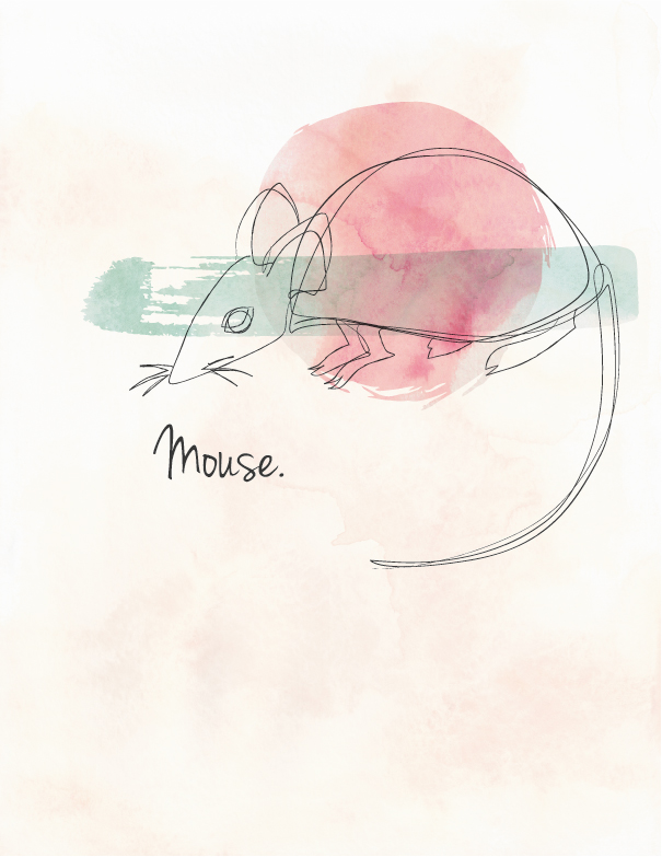
So, to go on the current subject. While cleaning up some old books on my shelves I found very very old fine liner sketches I made as a child. It made me quite happy that they were time stamped – on 2003, so when I was 11-12 years old. You can see how time passed affected the paper and the lines themselves. I shared them with my friends and one of them planted in my mind an idea to redraw them and make sort of comparison of those old childish sketches to my own take on them 12 years later.

burd mouse2015-02-28 001

After examining them a bit I created a basic sketches using thick mechanical pencil (1.3 mm) on grid paper having fun with shapes trying to keep basic shapes and posing (alternating it a bit to improve it on final version).

2015-02-28 002 2015-02-28 001

I actually enjoyed that project and if I find more old works like that I might consider playing with them like that too. After creating basic outlines I decided to add to my revamp some more interesting twist by adding a color to the designs. You can also see I shortened bird’s legs to make it look more ‘realistic’ in shapes at least 🙂

birdie popart-01mouseywatercolor-01

It is quite simple yet pleasureful project, I really enjoyed reacting those illustrations. I hope you like them too! 🙂 They really brought me really nice break from everything else and I enjoyed that a lot. Had to share those : ) If you ever did something like this please share those with me, I would love to see the improvement over time of other people as well : )

first font creation – refining shapes.

blog post headerfont2

So, my font project is going along swell : )

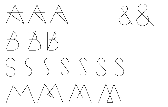
I decided to share with you guys the process of refining some shapes. Since it will be all caps font, I decided to create some alternate shapes of letters as well as refining the shapes to get the shapes exactly as I would like them to be. The biggest challenge was refining “S”. I wanted it to be nicely shaped and balanced while keeping a bit of corners like the rest of the letters.

one line alphabet-04

I started to work on ampersand as well, but that will be along way to get it where I will like it for sure.

With “A” The matter was that it looked a bit too pentagram-y, which was pointed out to me couple times. That made me want to refine its’ shape to keep the general way the letter was shaped but play around with lengthening middle bar.

one line alphabet-05Next thing were numbers. They weren’t that problematic although I needed some time to figure out properly numbers such as 3 and most troublesome – 8. I really like how those turned out. I might refine them after I will start testing those in some specific words : )

The last thing I am working on in font right now are diacritics. Since I live in Poland and most of my projects are made in this language, I decided to include polish letters into font. They turned out to be more troublesome than I anticipated at first, so I will need to dedicate much more time to refining those. For now they look like this:

one line alphabet-06The letters are respectively Ć, Ł, Ą and Ę. I like Ę the least and it will need some time from me to figure out. Supposedly I could just use the tails and bars to turn them into diacritics but I really want to keep through whole font the idea of glyphs shaped by one stroke of a pen, which is main philosophy behind my font.

If you are interested in reading first part of this series head down here:

Phase One:  main idea & creating first glyphs.

Thank you for reading, I hope this project is interesting for you! I will try to post another post about it as soon as possible to show you next step of my progress : )

Memories from Sweden poster set.

memories from sweden

Not long ago I was approached by my coworker with a commission for designing series of posters for her. I was delighted when I heard that, especially knowing her great taste in design! The brief was simple – 3 minimalistic posters that will be depicting things connected to her Erasmus trip to Sweden. She also had a quite good idea how she wants posters to look which made process even more enjoyable. Short brief I received:

Posters 1 & 3 – Dala horse with watercolor-style texture and delicate decorations + quote in Swedish

Poster 2 – Collection of quotes and buzzwords surrounding her trip and bringing back her memories

Inspiration material:

I loved the concept of posters immediately and quite quickly got to work. First thing to do was coming up with decorative elements to place on the horses. Those are sketches I provided my client with:

dala horses sketch

You can see ones she had chosen marked with an arrow : )

Based on those, I started to work on digital version. I used couple watercolor textures merged together and edited in Photoshop. After that I vectorize watercolor texture I created with Image Trace operation in Illustrator. That step was necessary since the poster was much bigger than textures size. Then I resized it to cover all the surface of the Dala horse.

The next step I did was creating vector representation of the designs I created for horses. I placed them then over the vector shape of a horse (which I created earlier and printed to sketch designs over).

After adding a quote the Dala horse posters were pretty much done. Then I moved on to middle poster with quotes. To fill them nicely on the surface I decided to create sort of labyrinth of words with different weights and sizes of same typeface. Then I empathized words that were most important with same red watercolor effect just as horses to tie all posters together with same theme.

posters_Malin_Strona_1 sm  posters_Malin_Strona_2 sm  posters_Malin_Strona_3 sm

My client was very satisfied with final outcome and I must say I think it ended up really good.

Final posters:

posters Malin

Font used: Nanami Pro

Hope you liked that project, I am really proud of how it went and I think my client feels the same. I hope I will get in future much more awesome projects to work on like this one! 🙂

first font creation project.

blogpost font

Hello, sorry for being a bit late. I know I also missed last post but I decided to pressure myself less into making 2 posts a week and always on time – I am finishing my studies right now and I simply do not have the time to work on that much projects and posts each week. So, without further ado – lets get to the post.

Lately I got idea for creating my own font – I wanted to do something like that since a while but I just never really had a time or idea that would captivate me so such plans were put away over and over. Finally though I got the idea I decided I want to explore and I am slowly working on glyph shapes etc. I want to make it in variety of weights and widths but we will share how that will turn out. Possibly it will end up as just one, regular weight font – we will see how it will go.

WP_20150129_22_53_23_Pro

Here you can see the preview of my first sketches for glyph shapes – idea is to create all letters with one continuous stroke.

one line alphabet_abcd

After I got general idea of how i want all letters to go, I started creating digital previews of them in Illustrator – I might not be able to create font there but it’s a vector creating software I am most familiar with so this was my go-to. After playing a bit with grid and different strokes I created digitalized preview of my font. It is still very rough and needs lots of work but since this will be longer, ongoing project I decided to share it step by step, not my usual whole project in a post thing :). For now I am planning to show just a previews, since I want a final result to be more exciting. At least this is what I am hoping for.

I hope you like my font idea and you will follow how it is progressing over time! I am surely having lots of time with it, especially with not pushing myself to finish it in a week or two and just make it a project I will develop in free time as relaxation tool. Please share with me your thoughts about the idea itself as well as execution : )

beyond the sun – fake album cover design.

beyon the sun banner

I am very sorry for being so late with this post but wordpress for unknown to me reasons didn’t allow me to upload any media >< I promise I will try to clean up my act in posting on schedule department : )

Lately I listened a lot to Shinedown and I became strongly inspired by one of their songs called “Beyond the sun”. I started to think how would I see cover for this song’s single and decided to make it next of my personal projects. After some time with blend tool and different object modes I created the cover you can see downstairs. I wanted to make it very dark – as you can see it is mostly black. It somehow made sense that beyond the sun everything would be dark and barely lit. I wanted text to be delicate and not dominant at all, but become part of illustration I created for cover. At first I was working with pinks but over time I decided to give it more of orange-y tone.

beyond the sun_shinedown_CD cover-01

When I started to create light effects I got a bit overboard with them but after some time I decided that less is more and simplified illustration. That definitely made it look much more interesting. After adding some more details I decided to just stop to not overdo it again. The final step was adding single title and band name to finish fake album cover look.

beyond the sun

So, this was definitely a lots of fun to create, I hope I will get such nice inspiration from my favourite music more often 🙂 Did you ever let your inspiration lead you this way? I never was doing things like that (till now) and I must admit I really did enjoy that project 🙂