Memories from Sweden poster set.

memories from sweden

Not long ago I was approached by my coworker with a commission for designing series of posters for her. I was delighted when I heard that, especially knowing her great taste in design! The brief was simple – 3 minimalistic posters that will be depicting things connected to her Erasmus trip to Sweden. She also had a quite good idea how she wants posters to look which made process even more enjoyable. Short brief I received:

Posters 1 & 3 – Dala horse with watercolor-style texture and delicate decorations + quote in Swedish

Poster 2 – Collection of quotes and buzzwords surrounding her trip and bringing back her memories

Inspiration material:

I loved the concept of posters immediately and quite quickly got to work. First thing to do was coming up with decorative elements to place on the horses. Those are sketches I provided my client with:

dala horses sketch

You can see ones she had chosen marked with an arrow : )

Based on those, I started to work on digital version. I used couple watercolor textures merged together and edited in Photoshop. After that I vectorize watercolor texture I created with Image Trace operation in Illustrator. That step was necessary since the poster was much bigger than textures size. Then I resized it to cover all the surface of the Dala horse.

The next step I did was creating vector representation of the designs I created for horses. I placed them then over the vector shape of a horse (which I created earlier and printed to sketch designs over).

After adding a quote the Dala horse posters were pretty much done. Then I moved on to middle poster with quotes. To fill them nicely on the surface I decided to create sort of labyrinth of words with different weights and sizes of same typeface. Then I empathized words that were most important with same red watercolor effect just as horses to tie all posters together with same theme.

posters_Malin_Strona_1 sm  posters_Malin_Strona_2 sm  posters_Malin_Strona_3 sm

My client was very satisfied with final outcome and I must say I think it ended up really good.

Final posters:

posters Malin

Font used: Nanami Pro

Hope you liked that project, I am really proud of how it went and I think my client feels the same. I hope I will get in future much more awesome projects to work on like this one! 🙂

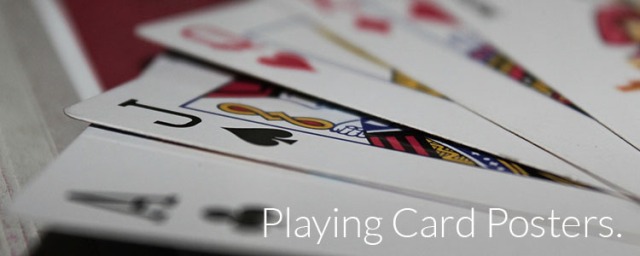
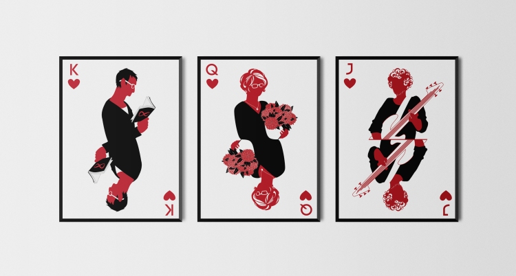
playing card posters.

playing card posters

As Christmas gifts for my family I created 3 posters for each that included portrait of them stylised into playing card figures. The idea started before I even thought about the exact form I wanted them to take – while looking at my older works I found my Ouija Board redesign which was black red and white, just as most basic playing card palette. This is when I got idea to create some interesting posters using playing card style.

Then Christmas shopping fever came and I absolutely couldn’t find anything worth for a gifts for my family every idea I had for a gift turned out just not good enough. With time breathing down my neck I had to move fast to manage preparing whole project on time (according to Polish tradition the gifts are given and received on Christmas Eve).

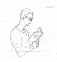
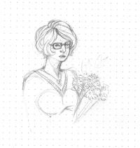
As usual, I started my works with sketching. I created 3 portraits of my mom, dad and brother based purely on my memory – probably if working on someone not as close to me as them I would need a reference 🙂

2015-01-01 0022015-01-01 0032015-01-01 001

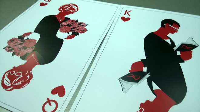
Based on those sketches I created vector art graphics. Portrait of my brother was first one I started with and it was the one I did most of my experimenting on. As you can see on sketches at first I wanted to keep facial details and make it more realistic. Over time I decided on more stylised version, made rather of flat color surfaces than lines. This is how final version emerged and was a basis for other two portraits. I went through many different solutions – and every portrait brought me different challenges to tackle. Most problematic in each were accessories which I assigned to them – I wanted each to have something that made me think of them as well as would make it more obvious whose depiction it was, which was especially important when I discarded face details. I decided to give each card different marking – J for my brother, Q for my mom and K for my dad.

WBD_card_krzywe-01MED_card_krzywe-01ZSD_card_krzywe-01

After I was done with design process I moved on to the printing process – I used services of one of my favorite digital print shops that gratifies student discounts :P. I decided to print them in A3 size, since it seemed most suitable in the matter of size. A4 seemed too tiny and anything bigger could cause problems to find proper place to hang them.

WP_20141222_002

Photo from printing-house 🙂

Last step was framing. I decided on IKEA’s Stromby frames in 30×40 cm size which turned out to be bit troublesome. I didn’t have time for looking for other frames, not to mention that here in Poland IKEA frames are definitely the cheapest not losing on quality. Since A3 size is 29,7×42 cm I had to cut the posters in height which caused partial removal of gray playing card frame I added along the edges of the poster. It’s a shame but I must admit that whole process was extremely fast from sketching phase to printing and I simply didn’t think about framing till the day before. At least I learned to pay more attention to it on design phase from now on 🙂

 cmas gifts frames

This picture is a mock-up and because of esthetic reasons i allowed myself to remove gray frames you can see on designs above.

I hope you enjoyed this and like the final look of my creation. I think it is one of my most successful personal projects I did lately. Please feel free to comment and give me any tips on how could I improve this type of design for future.

Sorry for being bit late with post again, but I think it is understandable in such crazy time as New Year’s Eve 🙂 I hope you spent it in great atmosphere and I wish all of you that the freshly started year will be better than any before!

creating personal branding.

branding post head

Since I started to work professionally and already developed my own logo I decided to take step further and go on with creating personal branding identity for myself as a designer. Quite obviously I started from most popular yet at the same time crucial element – business card. I went through many different ideas and I want to share my design process with you.

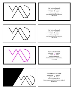
First idea that popped into my mind was creating see through business cards printed on the PCV foil. Some problems arised on the way though. Firstly  the price that made them around 4-5 times more expensive than regular business cards, secondly the time wasn’t in my favor and lastly – I couldn’t get the design to the point where I would be satisfied with. Some of best versions (in my opinion) you can see below (click the image for enlarged version):

bc 1After resigning from transparent business card idea (I might come back to that in the future though 🙂 ) I set on doublesided design – I wanted to keep idea very close to the previous one but to separate logo and personal information. The next problem that appeared was that  frame made the design look a bit deadly when transparency was out of the picture. That’s when I started to experiment with removing frame, adding color etc. This process you can see on the image below (click it for enlarged version):

bc 2

Finally the design was established on the adding color, but in more dynamic way than I planned at first. I am definitely really satisfied with final look of it and I will proudly hand those out (which in my opinion is the first test of business card). Here you can see the final version:

Realistic Business Card Mock-Up

After I was done with business card it was the time to start whole branding idea. Based on shape of my logo I created pattern where it was the element creating it. It turned out really cool and I plan on trying to turn it into seamless .ai pattern in near future.

Bez nazwy-2-01

Based on my logo, pattern and color scheme from business card I designed full branding identity (which I hope to someday make a reality! 🙂 )

Black & White Branding Mock-Up MADMADMAD

What I learned from this project is probably that most important is to be ready to resign from some aspects of design, which may work miracles and simply free the idea to evolve into something much better and much more satisfying.

I hope this post will help you through your own design process and stay tuned for next Design Wednesday (and Talking Saturday)!